top of page
FulfillmentVu
client. Ware2Go (UPS Subsidiary)
tools. Figma, Illustrator, and Fullstory
type. Web Application
This application allows merchants to take control of their warehouse storage needs, optimize order fulfillment, and unlock smoother logistics for their business.
FulfillmentVu
client. Ware2Go (UPS Subsidiary)
tools. Figma, Illustrator, and Fullstory
type. Web Application
This application allows merchants to take control of their warehouse storage needs, optimize order fulfillment, and unlock smoother logistics for their business.
FulfillmentVu
client. Ware2Go (UPS Subsidiary)
tools. Figma, Illustrator, and Fullstory
type. Web Application
This application allows merchants to take control of their warehouse storage needs, optimize order fulfillment, and unlock smoother logistics for their business.
app. FulfillmentVu
date. 2020-2021
client. Ware2Go (UPS Subsidiary)
tools. Figma
type. React App
This application --------------
app. FulfillmentVu
date. 2020-2021
client. Ware2Go (UPS Subsidiary)
tools. Figma
type. React App
This application --------------
app. FulfillmentVu
date. 2020-2021
client. Ware2Go (UPS Subsidiary)
tools. Figma
type. React App
This application --------------
app. FulfillmentVu
date. 2020-2021
client. Ware2Go (UPS Subsidiary)
tools. Figma
type. React App
This application --------------
FulfillmentVu
client. Ware2Go (UPS Subsidiary)
tools. Figma, Illustrator, and Fullstory
type. Web Application
This application allows merchants to take control of their warehouse storage needs, optimize order fulfillment, and unlock smoother logistics for their business.
FulfillmentVu
client. Ware2Go (UPS Subsidiary)
tools. Figma, Illustrator, and Fullstory
type. Web Application
This application allows merchants to take control of their warehouse storage needs, optimize order fulfillment, and unlock smoother logistics for their business.
FulfillmentVu
client. Ware2Go (UPS Subsidiary)
tools. Figma, Illustrator, and Fullstory
type. Web Application
This application allows merchants to take control of their warehouse storage needs, optimize order fulfillment, and unlock smoother logistics for their business.


Qutee
client. Qutee
tools. Sketch, Photoshop, Illustrator, and Hotjar
type. Website
This case study explains how I transformed raw market research into a captivating product. I took on the entire design journey, from understanding user needs through in-depth research to crafting interactive prototypes and building a strong brand identity.
The Challenge
A standard issue with comment systems such as Facebook and Reddit is the difficulty in extracting quality comments from conversations. Users are stuck without a way to filter comments that suit their interests. To resolve this issue, I collaborated with the founder of Qutee to create the first intelligent discussion website of its kind.
My role involved redesigning the initial product which required a detailed approach to defining the UX strategy, IXD, branding, graphic design and copywriting.
Market Analysis
To gain actionable insights, we had to understand Qutee's position amongst its competitors. After researching the existing market, we found that Qutee offered the most extensive feature list. Although more features don't necessarily mean a better product, a seamless UX does.
Our competitors were focused on starting debates about single topics without a means to filter the conversation. However, Qutee sought to weave together multiple discussions, intent polling and comment filters to provide extensive details about each topic.
Extensive web research captured a range of qualitative and quantitative data, driving our understanding of the marketplace and the opportunity to create an innovative polling experience.

Personas
As part of the research phase, I conducted Guerilla UX to capture a glimpse of the target audience. These personas provided user goals and pain points, resulting in a better understanding of the problems we needed to address.

User Stories
Based on the persona insights, I began to map out user needs and goals by turning them into user stories. By mapping out the features and functional requirements, the product's scope becomes more defined.

User Flows

The next step was to map user flows within the product. My goal was to reduce the number of steps needed for each user to complete their tasks.
Task Flow: A new user creates an account to post a comment.
Wireframe Sketches
Once the project's scope was understood, I began sketching UI components. Since a project's requirements are continuously evolving, drawing allows me to quickly iterate new ideas.

Wireframe Sketch: A new user visits the homepage (logged out state, above the fold).
Low Fidelity Wireframes
After sketching the initial UI, I started creating mid-fidelity wireframes. By using a 12 column grid, I was able to map out the page's architecture. During this phase, it is essential to identify the typographic scale and the proper dimension of each element.
.png)
Wireframe: A new user visits the homepage (logged out state).
User Flows
Accompanying the wireframes, I documented each user story with a UX-flow deliverable. These flows are particularly useful when presenting the complex interactions between core pages. To test the validity of the flows, I created clickable prototypes using InVision to ensure the flows were seamless.

Wireflow: A user signs in to register a new account.
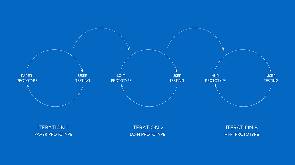
Quality Assurance
Prototypes are typically tested during their second and third iterations. Since we wanted to nail the details and iterate quickly, we used Invision to create interactive prototypes. This Quality Assurance cycle allows for testing assumptions and validating them before implementing the final design.
Branding
Once the style guide was in order, I created several variations of the logo. The first design was a wordmark to familiarise the audience with the brand. Since the business was still new, we wanted to ensure that the audience could identify the name before being presented with a brandmark logo.
The second logo, the brandmark, is how we intended to present the brand when faced with space restrictions. Each variation emphasized the "Q" which symbolized the company's theme — "Query tags for accessible data."

High Fidelity Mockups
My aim was to create a visual representation of the live screen. This provides a great opportunity to reinforce a brand's colors, typography, and overall style.
Hi Fidelity Mockup: Qutee's Homepage (logged out state).

Final Thoughts
From 0 to over 70 design implementations – that's my Qutee story. But the real impact lies in what it enabled: giving social media influencers the gift of insightful data about their audience. This translates to tailored content, deeper connections, and explosive engagement – a revolution I was proud to be a part of.
bottom of page