Qutee
client. Qutee
tools. Sketch, Photoshop, Illustrator, and Hotjar
type. Website
Please scroll down to explore my comprehensive design process. This case study outlines how I transformed market research and user insights into a highly interactive product. From initial requirements gathering and user interviews to the development of engaging prototypes, I oversaw every stage of the design process, including branding. The result is a product that users find engaging and enjoyable.


Qutee
client. Sentiment 360
tools. Sketch, Illustrator, Photoshop, and Hotjar
type. iOS App
This case study explores how we created an exclusive iOS app to transform superficial online discussions into actionable insights. Dive deep into how we built a powerful tool for analyzing trends, YouTube, and gaming.
Overview
Once the website experiences were established, the stakeholders decided it was time to design an iOS app. Making sure the app was suited for the user base depended upon the following factors: available budget, intended purpose, and required features.
The inherent advantage of having an app alongside a mobile site was to encourage regular usage among users. For Qutee's audience, this was achieved by designing an interface that is similar to a gaming experience.

Content Inventory and Site Map
Tools: Google Docs, Illustrator and Mockflow
Process: The first stage of designing an app starts with creating a content inventory that's based on helping users' achieve their goals. I began by listing the project's components in a Google Doc.
This inventory includes various elements, such as required screens, modals, and assets. It identifies which structural components are needed to plan the app's architecture.
Once the list is complete, I convert it into a clear and concise sitemap, using Adobe Illustrator and MockFlow. Laying out the content in this manner makes it easier to understand the app's overall navigation.

Wireframe Sketches
Tools: Pencil, Paper, and a Ruler
Process: Here's where I roll up my sleeves to define each screen's UI and functionality. A total of about 75+ screens were drawn to make sure each user scenario was covered. Sketching the screens by hand allows me to make simple edits and quickly iterate on the concepts.

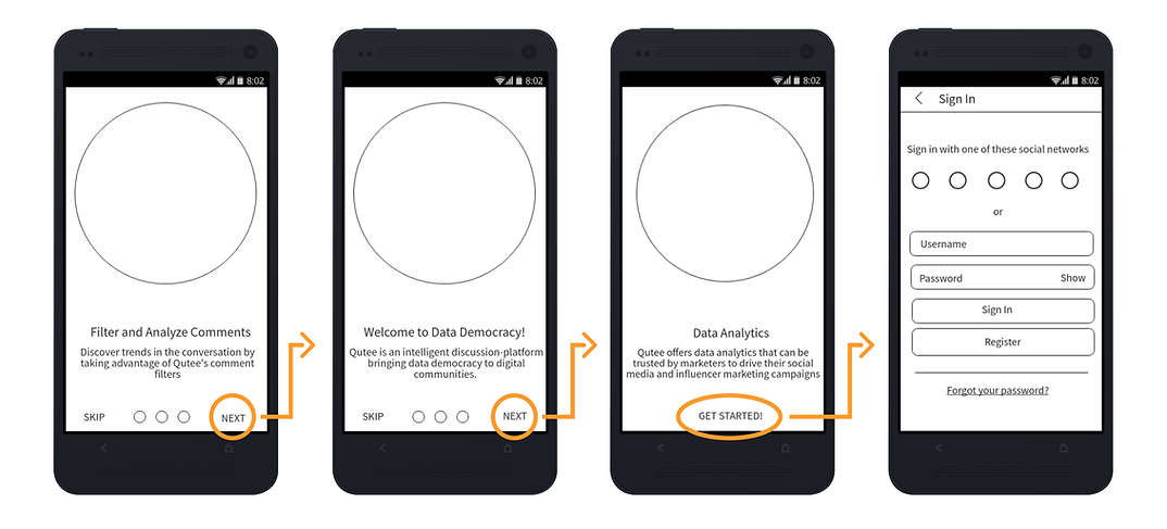
User Flow: Initial on-boarding screens
Low Fidelity Prototype
Tools: Mockflow, Adobe XD, and Invision
Process: The next step was to convert the sketches into a clickable prototype. During this phase, I start by designing low fidelity wireframes with MockFlow or Adobe XD, then export them to Invision.
Once the wireframes are complete, I use Invision to link the static screens into an interactive prototype.
Usability Testing
Tools: Screenflow, a desktop or laptop, mobile phone, and a GoPro w/ a tripod
Process: Next, we proceeded to test the apps internally, among our QA team. During usability testing, I kept track of user navigation, navigational and presentation errors, control usage problems, and scenario completion.
For this section, I was required by the stakeholders to keep our testing information confidential. However, the following link contains the template used during our testing phase.
High Fidelity Mockups
Tools: Adobe XD, Sketch, Illustrator, and Photoshop
Process: Initial testing uncovered several pain points within our user flows. So we reiterated upon the designs until users were able to complete their goals without any obstacles.
Once the prototypes were error-free, I began designing High Fidelity mockups using Adobe XD. While working in XD, I switch between Illustrator for SVG assets and Photoshop for image editing (banners, etc.) Then annotations are added to the mockups to convey a sense of functionality.

High Fidelity Prototype
Tools: Adobe XD and Invision
Process: After the stakeholders approved of the design aesthetics, I linked together the high fidelity screens into a final prototype.
The following prototype was tested in front of several influencers to evaluate the Qutee page's overall user flow. It showcases how users can access the comment filters, intent polling, and converse with one another using the expandable comment system.
Final Thoughts
While designing the app we didn't try and reinvent the wheel. We stayed true to our brand and used the same colors and iconography from the website. By keeping the color palette simple and using grey hues to create an illusion of depth, we were able to achieve an interface that resembles a gaming UI.
Taking a minimalistic approach demonstrated confidence in the strength of the brand and product. We might have obsessed over the minor details, but doing so made it possible to create an immersive, unobtrusive UI with a seamless experience.